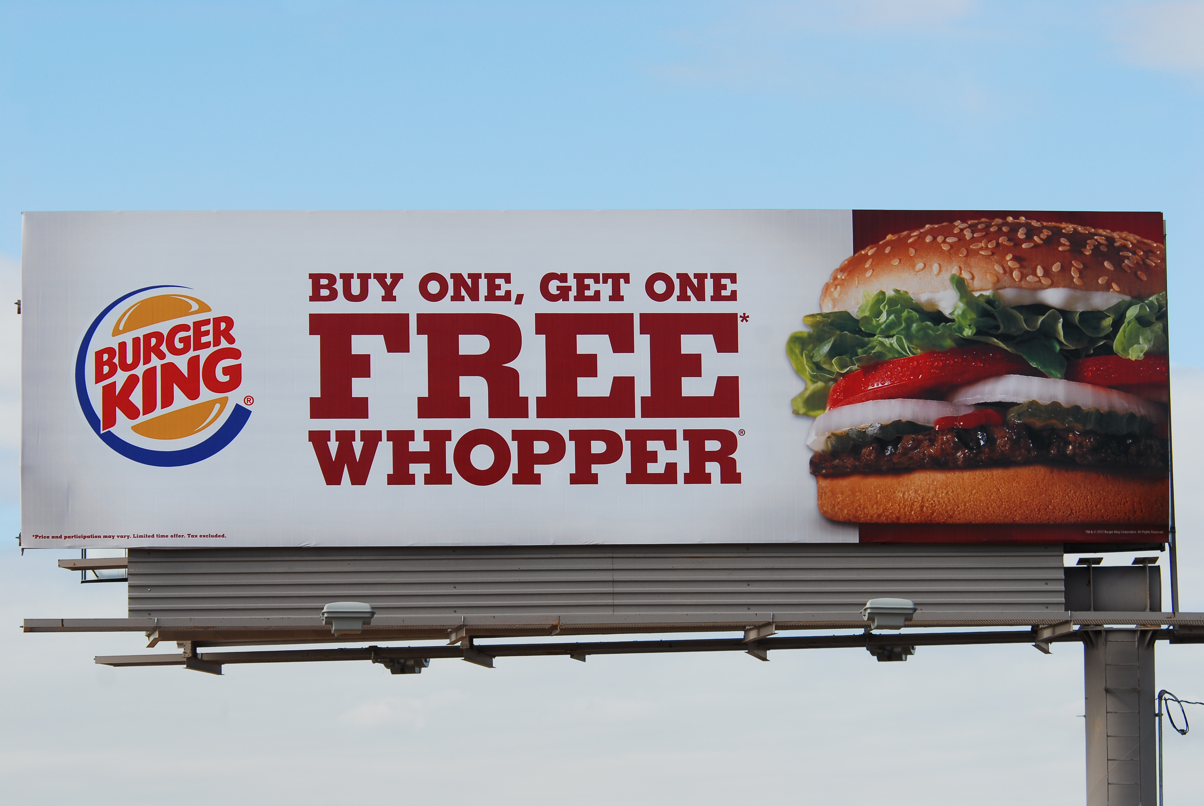
Designing a billboard is visual storytelling. An effective billboard grabs a person’s attention and creates a memorable impression, leaving the reader to think about the ad after they have driven by the billboard. The same principles can also apply whether you are designing a billboard to be printed on custom yard signs or a larger poster as part of a huge promotional campaign.
When designing a billboard keep the following in mind:
1. Simple Layout – LESS IS MORE – KEEP IT SIMPLE. The most effective messages are always the most simple. Your billboard should be a clear and brief expression of one idea.
2. Short Copy – Use short simple words with quick and easy comprehension. Limit or eliminate punctuation and edit down to the bare bones of your message. RULE OF THUMB: 7 WORDS OR LESS.
3. Viewing Time – Does your message communicate effectively within 5-10 seconds? REMEMBER: Your target audience is travelling past your billboard at 65 miles per hour.
4. Large fonts and text – Your goal is for people to read your message from as far away as possible. Calculate flesch kincaid grade level score of your message to know about the readability of the content. You can test your text against flesch kincaid grade level for a better understanding of the clarity of your message. Be sure the words are large, and the type is clear and easy to read. Bold, straight fonts work best. Be sure the words are large and the type is clear and easy to read. Bold, straight fonts work best. Avoid thin, ornate fonts. Sans Serif fonts work best. Adequate spacing between letters, words, and lines improves visibility. Drop shadows can help readability. You can improve readability and the attention people will show your billboard if you were to use video displays that use LED technology like you’re able to find over at companies such as SNA Displays and others.
5. Contrasting Colors – High color contrast is the key to good readability. Colors that work best: black, white and bold, primary colors like red, yellow and blue. Black text on yellow rates the highest in readability. Colors to avoid: brown, earth tones, pastels.
[adToAppearHere]
6. Single Image – Use one large image to attract the reader’s eye to the billboard. For example, a single image of a bottle works better than having 6. Take a small object and make it large (like jewelry) rather than making a large object small (like a house).
7. Simple Background – Use a simple background that does not interfere with your image, copy or logo. Too much blank space isn’t a good thing. Blank space doesn’t translate well from magazine ads to billboards. Use the blank space and make your fonts, image and logo bigger.
8. Call to Action – Is the call to action clearly found in the ad? Does your target audience have the necessary information to respond to your ad?
9. Balanced Logo – There has to be balance between the image and the logo. The logo is typically not as big as the image. About 1/8 of the board size is a pretty good guideline for the smallest the logo should be.
 Jim and his wife Karen own Onsite Insite. Onsite Insite offers billboards along the Santan Freeway Loop 202 between I-10 and the Price Freeway Loop 101 in Chandler. Onsite Insite is a member of the Outdoor Advertising Association of America (OAAA), Traffic Audit Bureau for Media Measurement (TAB) and Chandler Chamber of Commerce.
Would you like to design your own billboard? Email Jim at [email protected] for free specifications for designing a 14′ x 48′ billboard. http://www.azbillboard.com

